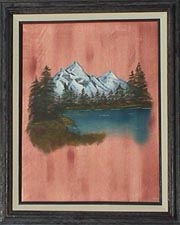
 Graffiti on Paneling
This one is supposed to look like it was painted on wood paneling. The original instructions did not mention knots and I felt there needed to be some, so I figured out how to add them. Now, if I could just get the paneling to not be so orange!
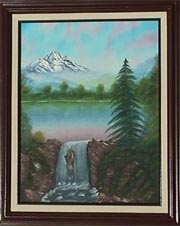 Mountain Falls
A fun one, with the mountain floating in the sky behind, and moss covering the rocks. You can't see it here, but in the original there is a tiny plant growing on the outcropping in the middle of the downpour. (Another one of my attempts at humor and making my instructor groan.)
...and I had a bit of a recent shock...seems one of my new neighbors is interested in buying this one! I can't imagine why... Of course, she DID see it at night, in a poorly lit room, so maybe that makes it look better. I dunno... I'll have to see what she thinks of it during daylight hours.
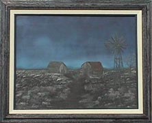
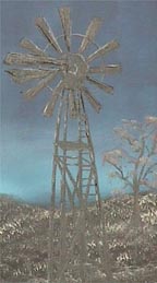 The Windmill under a Full Moon
This painting is very dark and hard to photograph. It is another black gesso painting. The colors in the sky are transparent/invisible and made visible by a certain technique. There's a trick to it, and I still hadn't figured it out for this one!

I felt I needed to put a lot of detail into the buildings and windmill to distract from the overall ugliness.
My neighbor has been trying to get me to sign it and sell it to him, but I dunno...just goes to show that even ugly dark art can be loved by somebody.
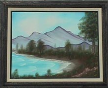 Quiet Inlet
This photo is NOT out of focus - the PAINTING is! Took me a while to figure out why I couldn't get a good picture, then a friend verified that there are no distinct edges in the water to focus on. Mystery solved. And here I thought my eyes were going bad...
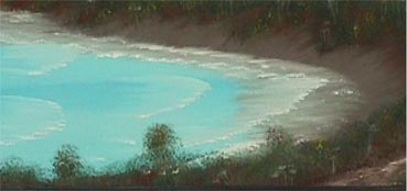
This painting appears to have motion. You can feel the water coming into shore as well as see it pull away from the beach in the continuing cycle.
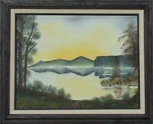 Mirror Lake
It's not easy trying to paint mountains upside down in reverse for a reflection. I thought of turning my canvas over to do it, but got my paintbrush slapped by the instructor for even *thinking* about cheating on it. I think I'll stick with reflecting the random leaves of bushes and trees...
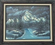 Midnight Mountain
Just plain ugly! My first black gesso painting. The colors in the sky are transparent/invisible and made visible by a certain technique. There's a trick to it - I just hadn't figured it out for this one.
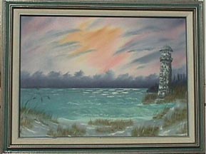 Lighthouse by the Sea
Catchy title, original. Of course, where else would a lighthouse be? "Lighthouse in Downtown Dallas". Now THAT would be interesting.
This one frustrates me. From a distance, the lighthouse looks great, but the waves are "missing". When you get close enough to appreciate the waves, the lighthouse looks horrid! *sigh* Hey, at least the sea grass on the beach came out nice!

You are visitor number:
Updated: November 10, 1998